01
Project Challenge
Objective
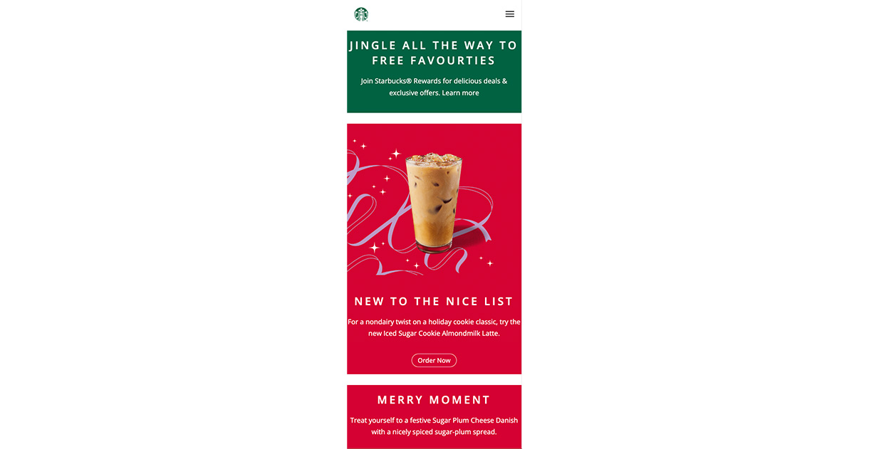
I want to test my skills by re-producing the world’s leading coffeehouse website. I came across a step-by-step tutorial to re-create the page. I learned a lot throughout the tutorial. Now I would like to attempt to re-create my own version.


02
Design Approach
Objective
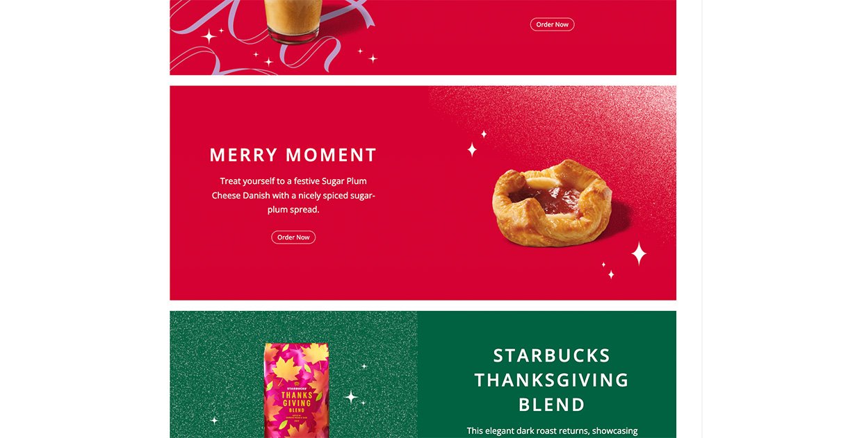
My first idea was to include a sidenavigation tab to keep the homepage as clear as possible. To promote various signature Starbucks coffees, I can create a slider effect that includes animation. I intend to provide a brief overview of the chain's history, including its founding date and its founder. I am going to incorporate the images used in the tutorial into the rest of the page because I like them. The style will be made up of various shades of green, white, and redish pink to reflect the colors of the brand.
03
The Solution
Objective
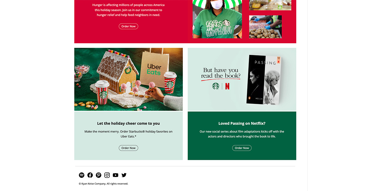
The final solution came out very well. The page's professional and elegant appearance is a reflection of the brand, as you can see. I would like to improve by including subtle coloring in the main section of the website. Despite the excess of white, the overall appearance is clear and effective. The slider animation at the start of the site is something I like because it gives the site a nice, polished look. The footer is pleasing and compliments the site's overall style.


