Project Challenge
Objective
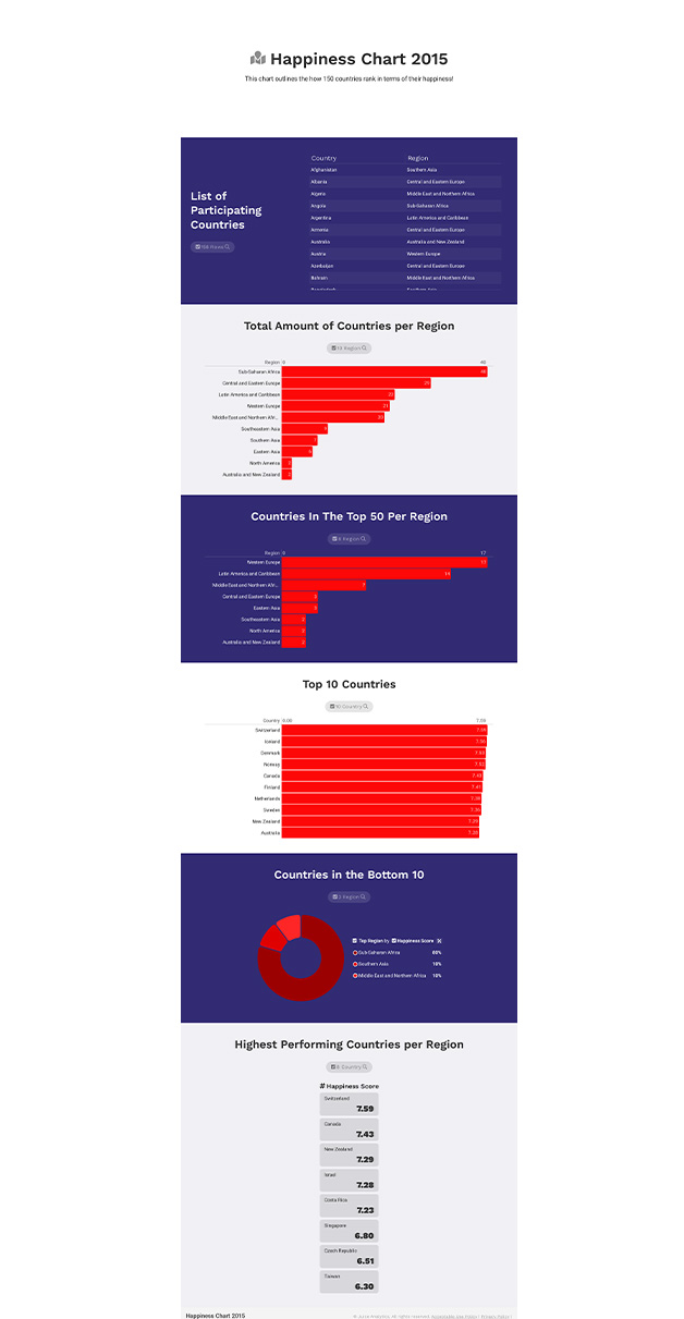
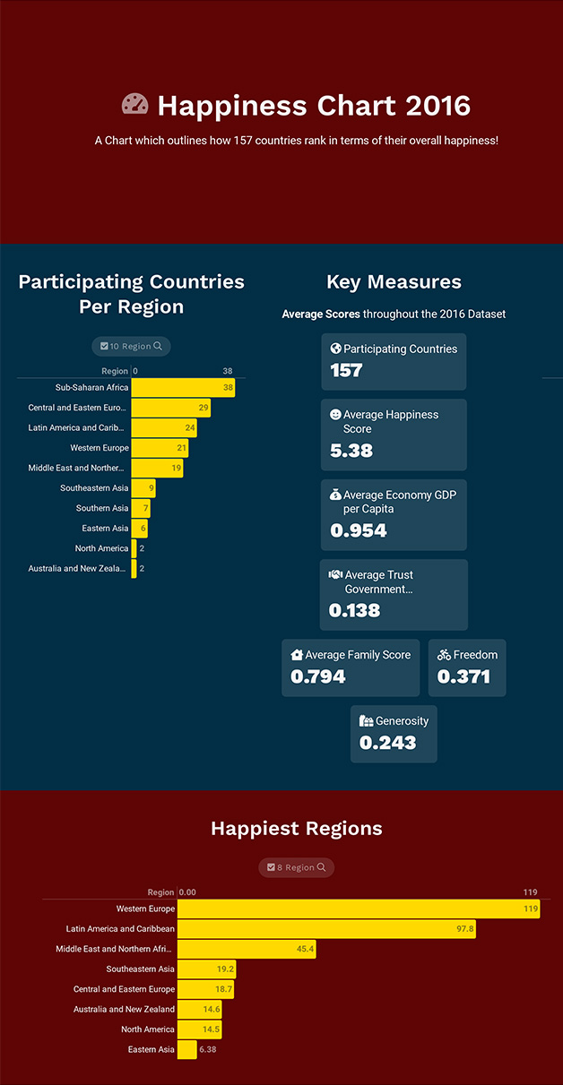
The Cantril scale or Cantril-ladder is an instrument for measuring people's attitudes towards their life and its components in various respects. The factors (levels of GDP, life expectancy, generosity, social support, freedom, and corruption) are estimated to contribute to making life evaluations higher in each country. The data set provided were collected and collated between 2015 to 2019. Review this data noting the overall ranking and score. For this project, I was tasked to provide a visual representations and correlations between each data set. I was asked to analyse and draw conclusions from the data on characteristics, similarities picked up with each country.
Design Approach
Objective
CSV (Comma Separated Values) is the format of all 5 files. CSV is generally faster and less complicated in comparison to
Excel.
I used Microsoft Excel to filter the data, once filtered I used a both Tableau and Juke box to produce my visual
representations.
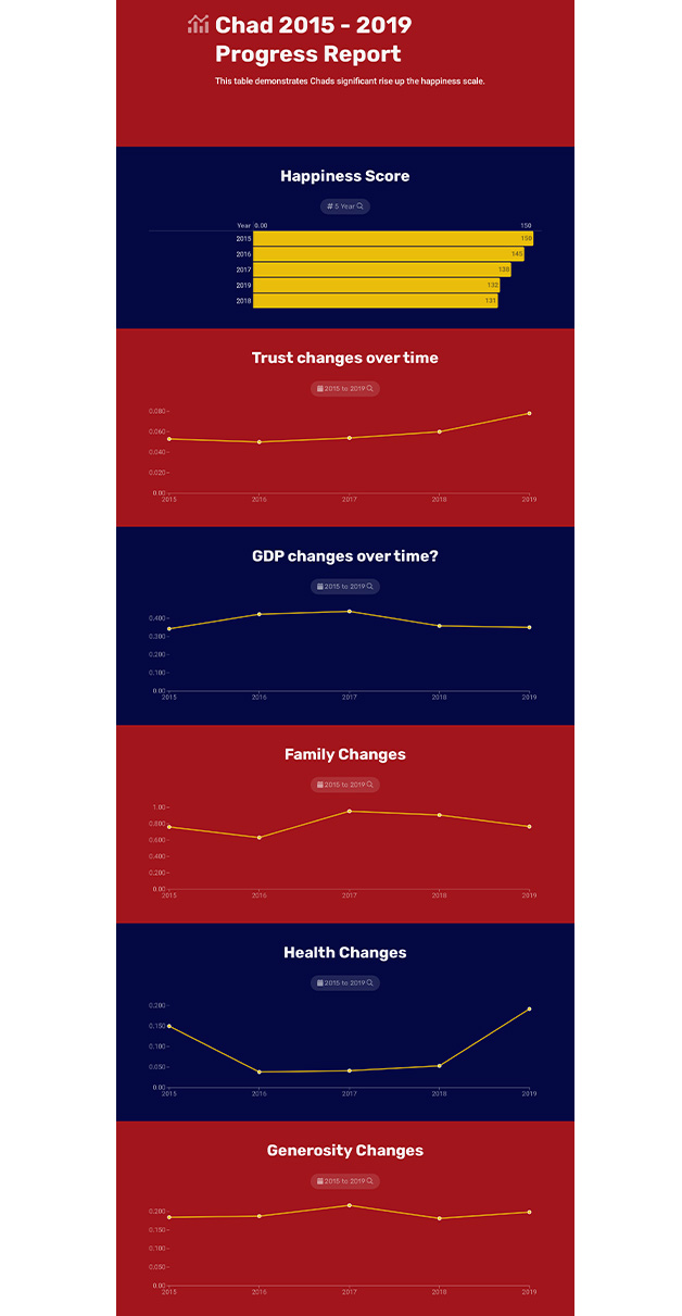
I made use of 3 graphs when conducting my analysis. Those 3 car Line graphs, bar charts and Pie charts. These are the
three I felt were best suited for this project.
The Solution
Objective
After assessing all 5 datasets I created a series of graphs which highlight countries who have performed well over the period. Those who have remained consistent followed by those that have performed poorly. The steps taken to fulfil this, were filtering copying the stats from all the key attributes per country as some datasets. I rounded the datasets from 2017 - 2019 to the nearest 3 d.p to fall in line with the data from the other two sets.


