Project Challenge
Objective
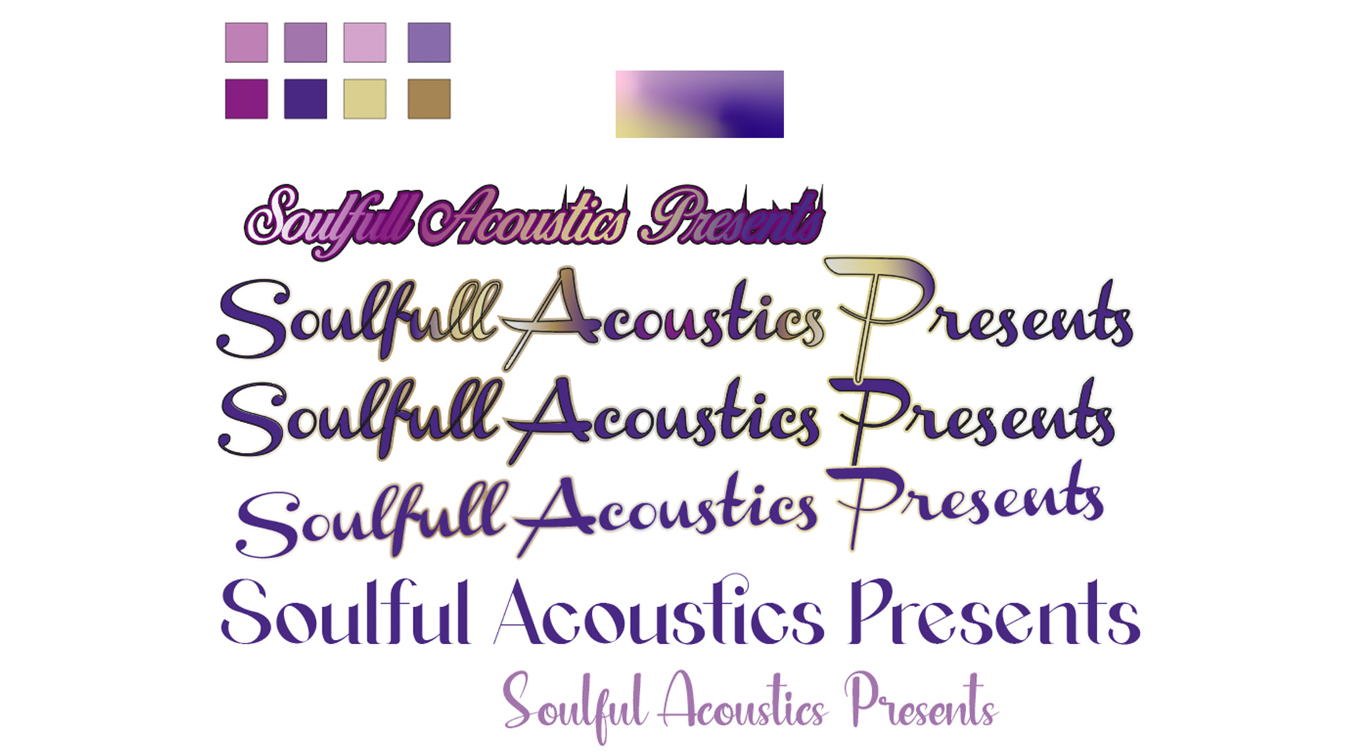
The client was looking for an elegant logo. Something that would showcase Crown Chakra vibes. They want the logo to contain colours such as Gold, Teal and purples as a way to empower female energy. The search began with a combination or desirable colours, in conjunction with a selection of elegant font styles. We filtered our favourites down to Birds of Paradise, Agraham, Blushful and Channel. I made her aware she will need to purchase the licence before using each font for commercial purposes. We decided that this was what was going to form the logo.
-
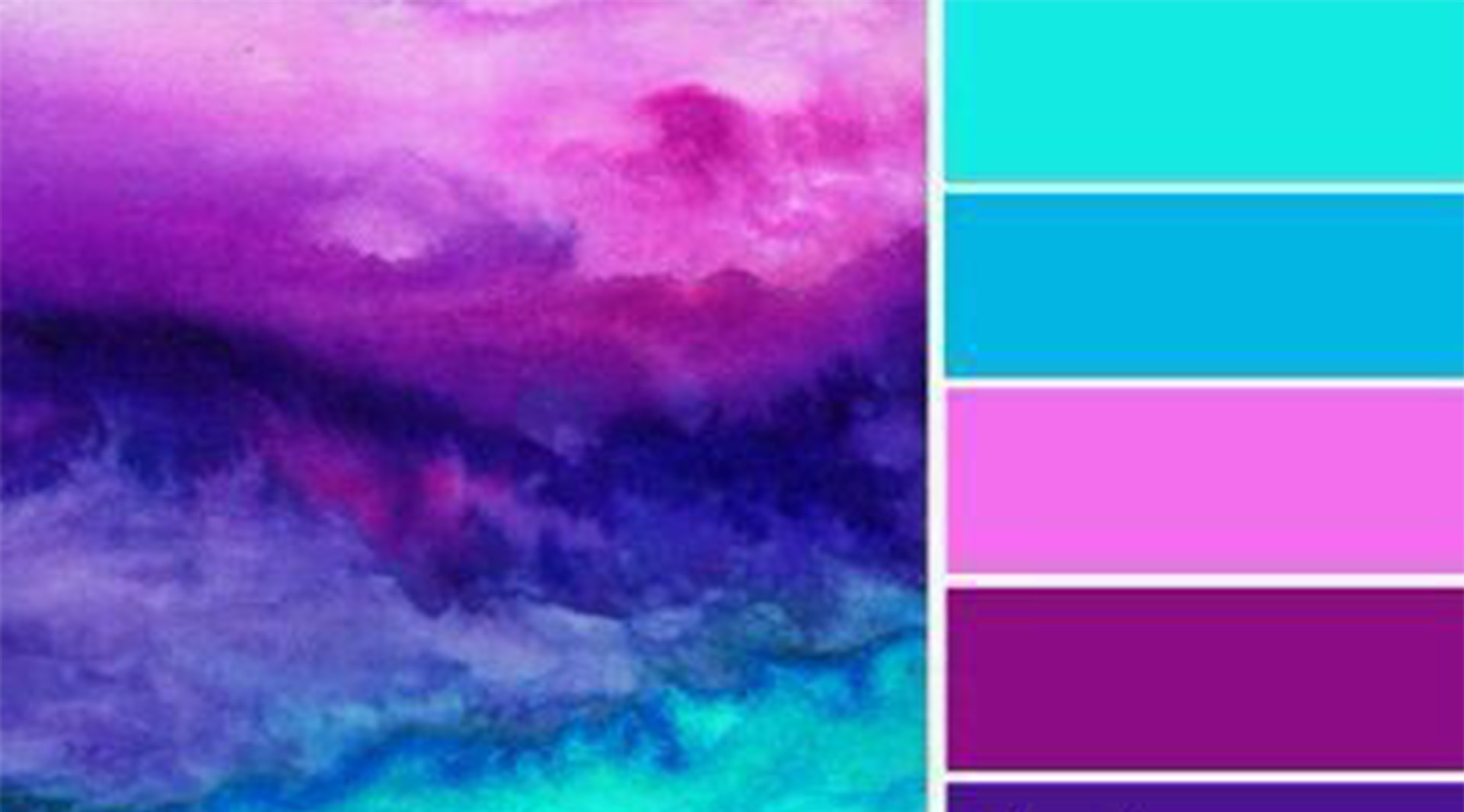
Chosen Colour Pallette -
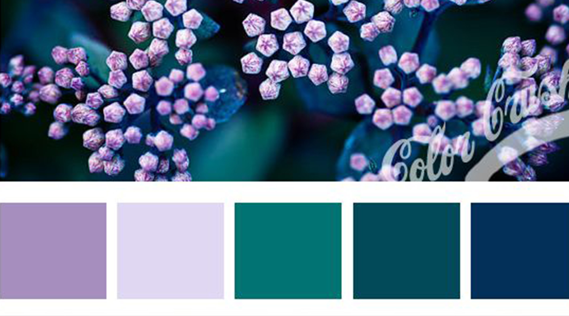
Chosen Colour Pallette -
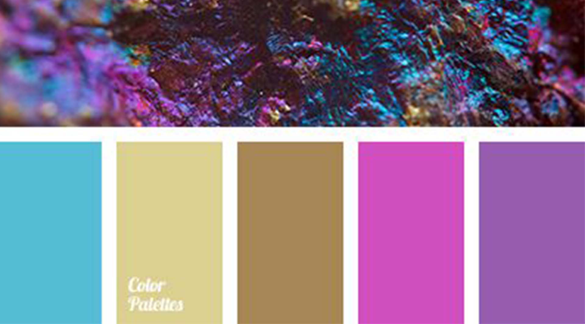
Chosen Colour Pallette -
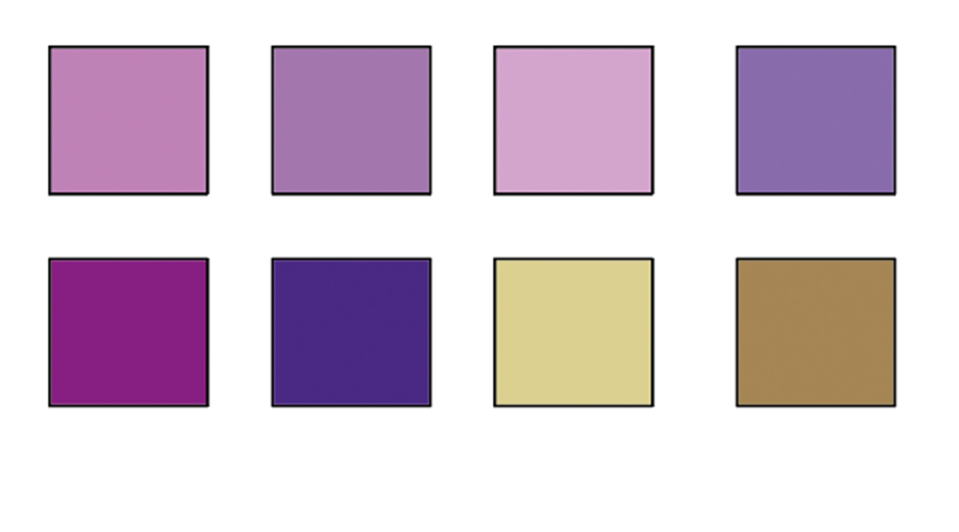
Chosen Colour Pallette
-
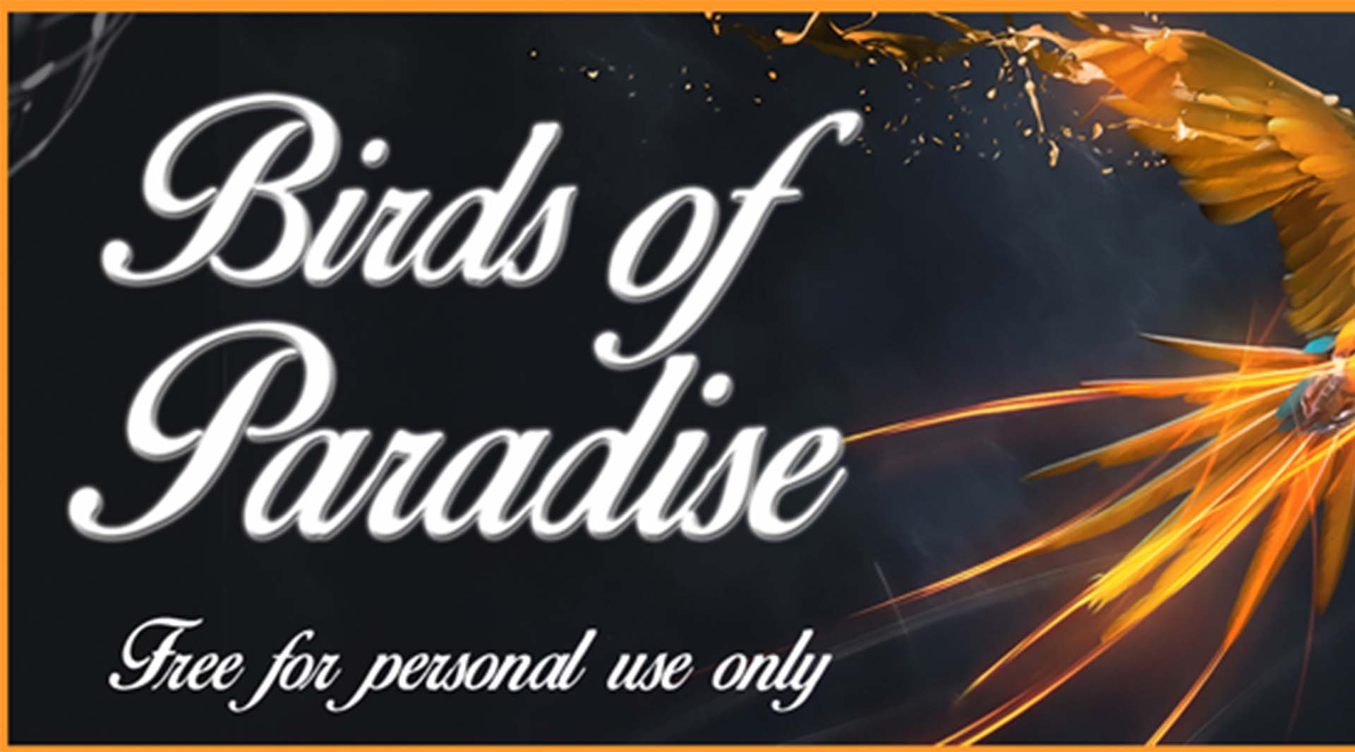
Font inspirations Birds of Paradise -
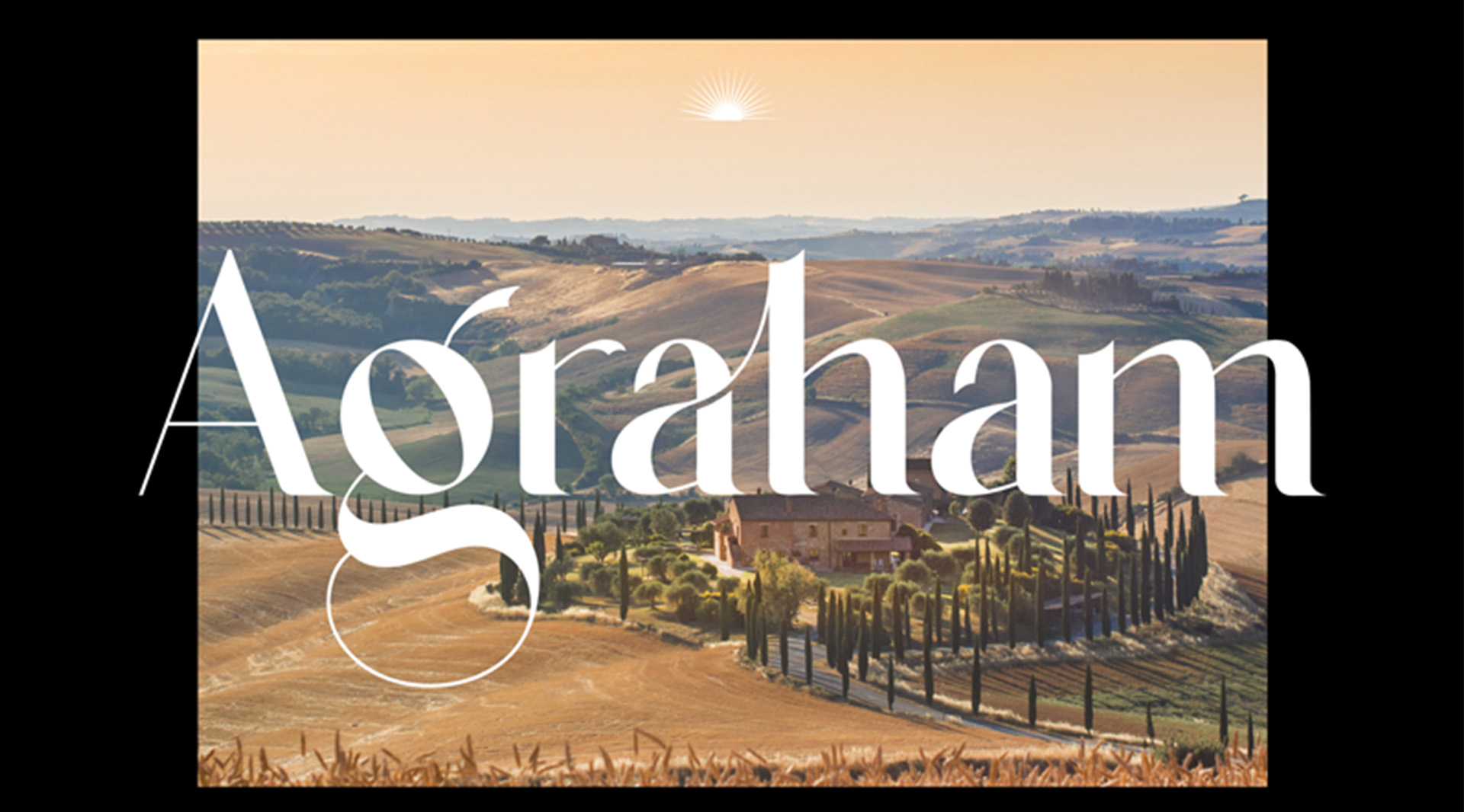
Font inspirations Agraham -
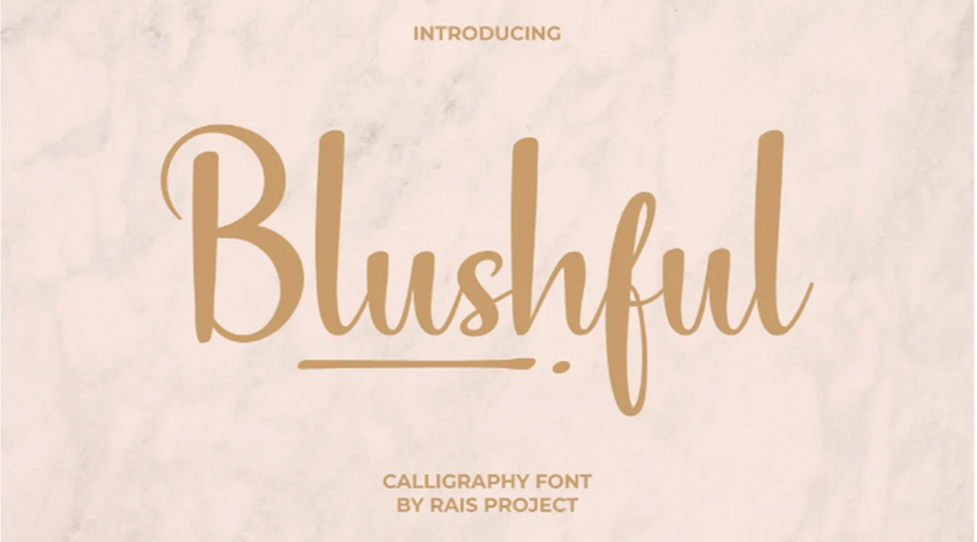
Font inspirations Blushful -
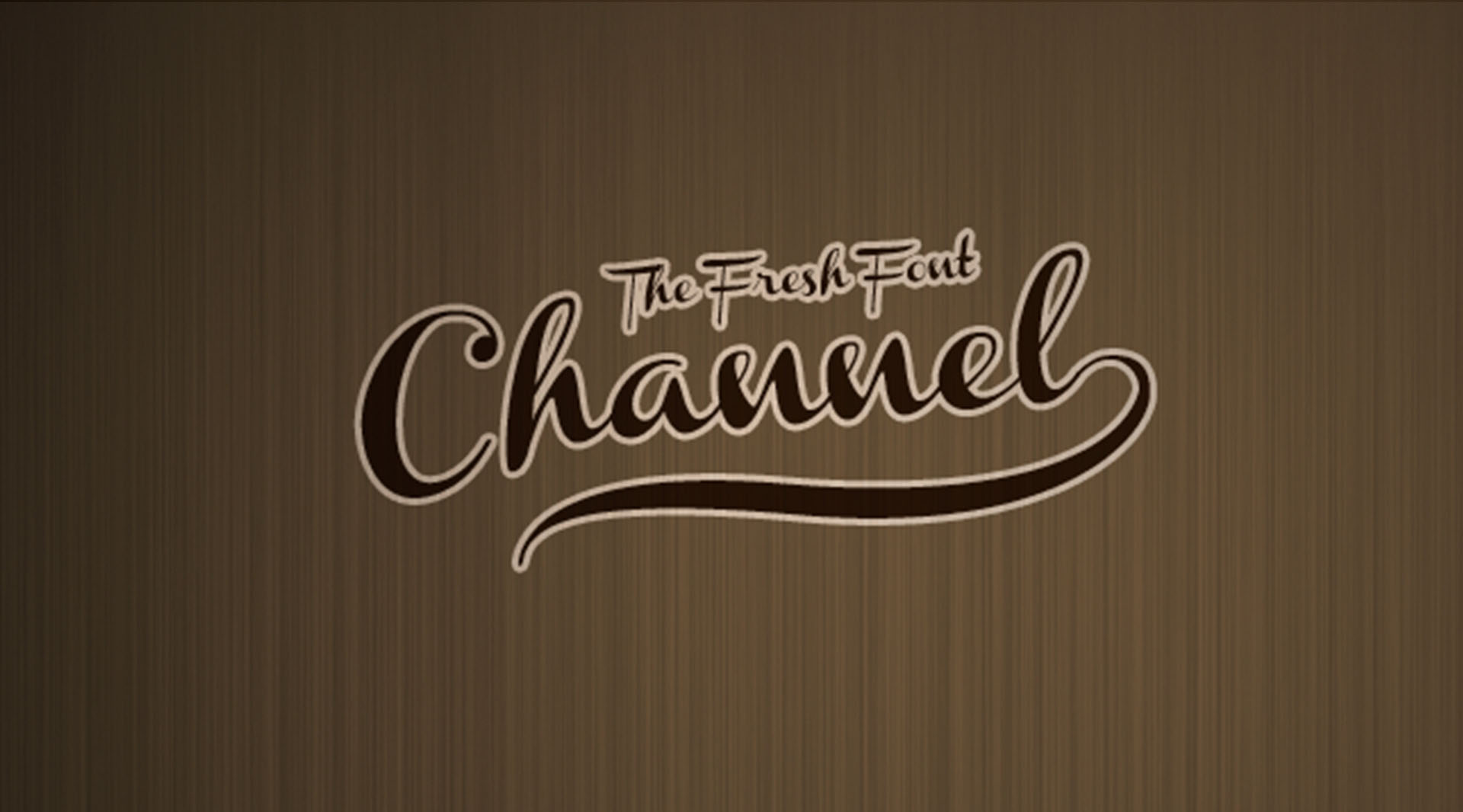
Font inspirations Channel
01
Design Approach
Objective
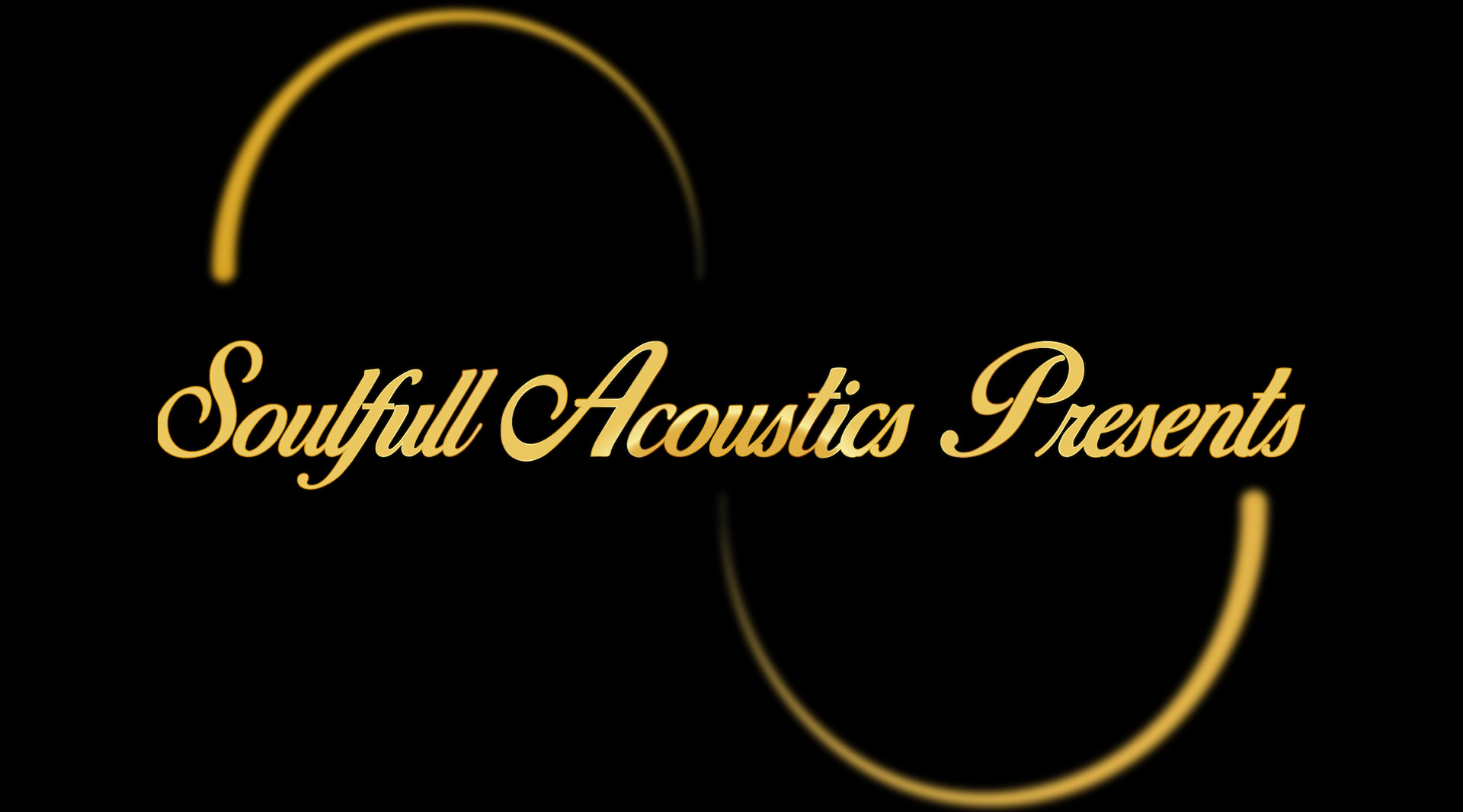
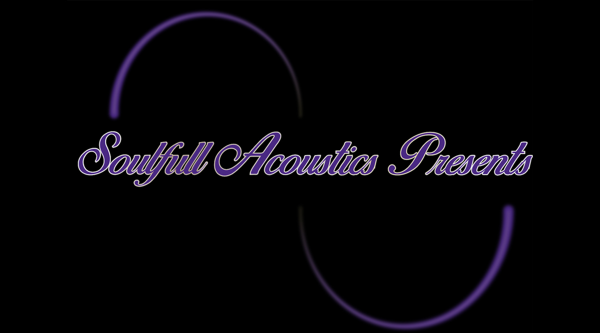
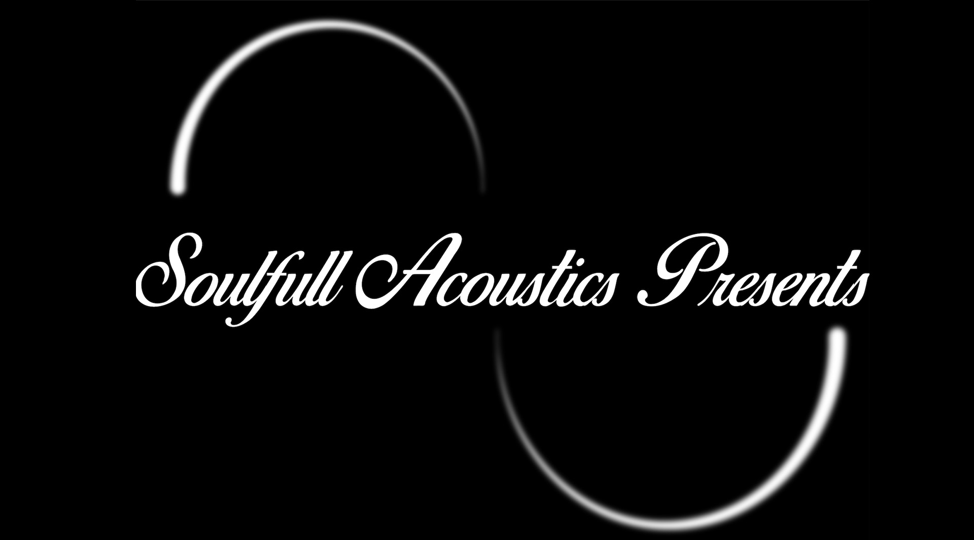
I used both Adobe illustrator and Adobe photoshop during the design process. My first idea included half a circle with a neon outlay. The client liked this as she felt it could resemble a positive aura. She wanted me to inlcude 1 at the top and the bottom. I experimented with the 4 chosen fonts in combination with the colour palette. I wanted the font to resemble a metal look. I made use of some a combination of photoshop filter effects to achieve this. The client decided her favourite font was the birds of paradise was her favourite font.
-
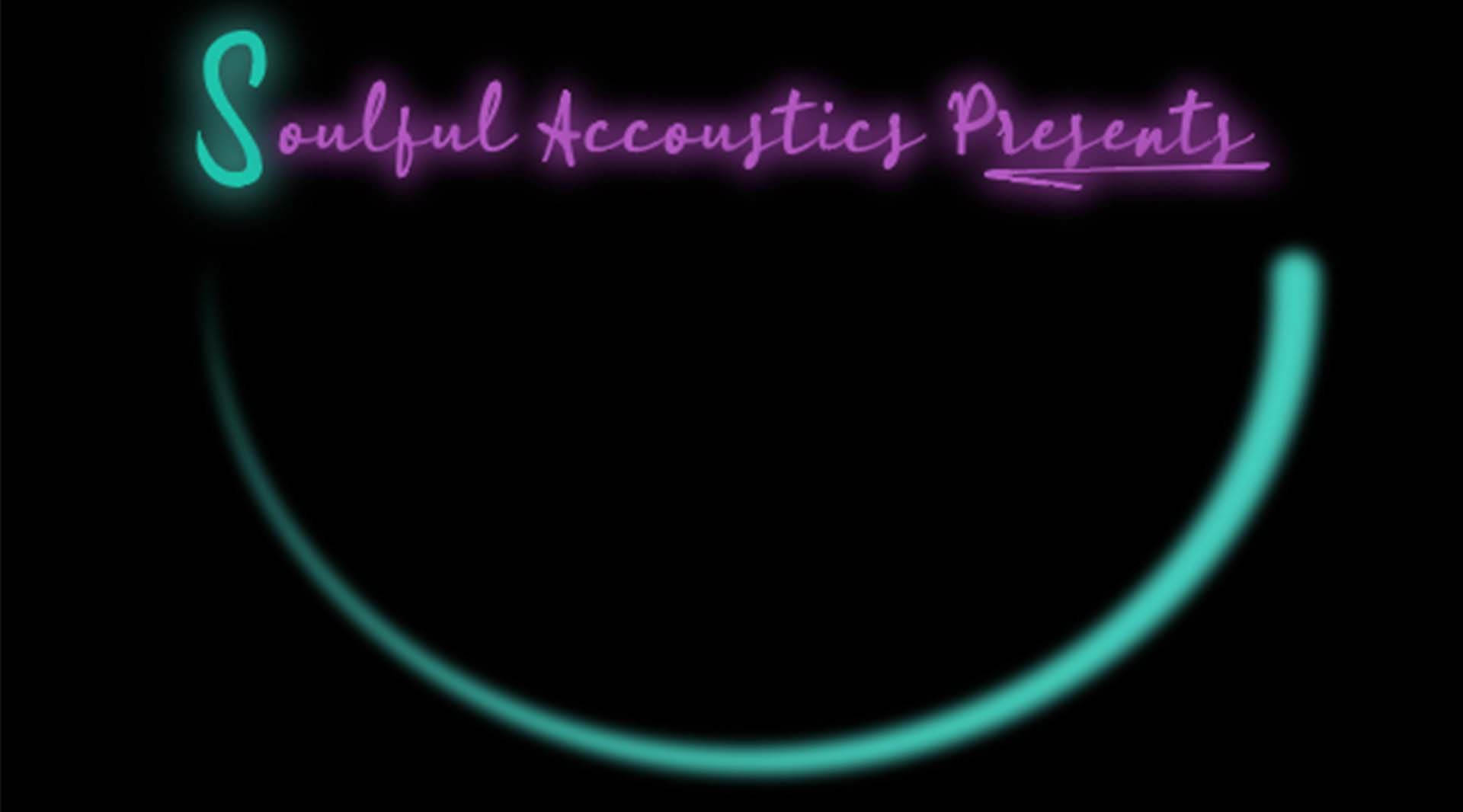
First Idea -

Second Idea -
Third Idea -
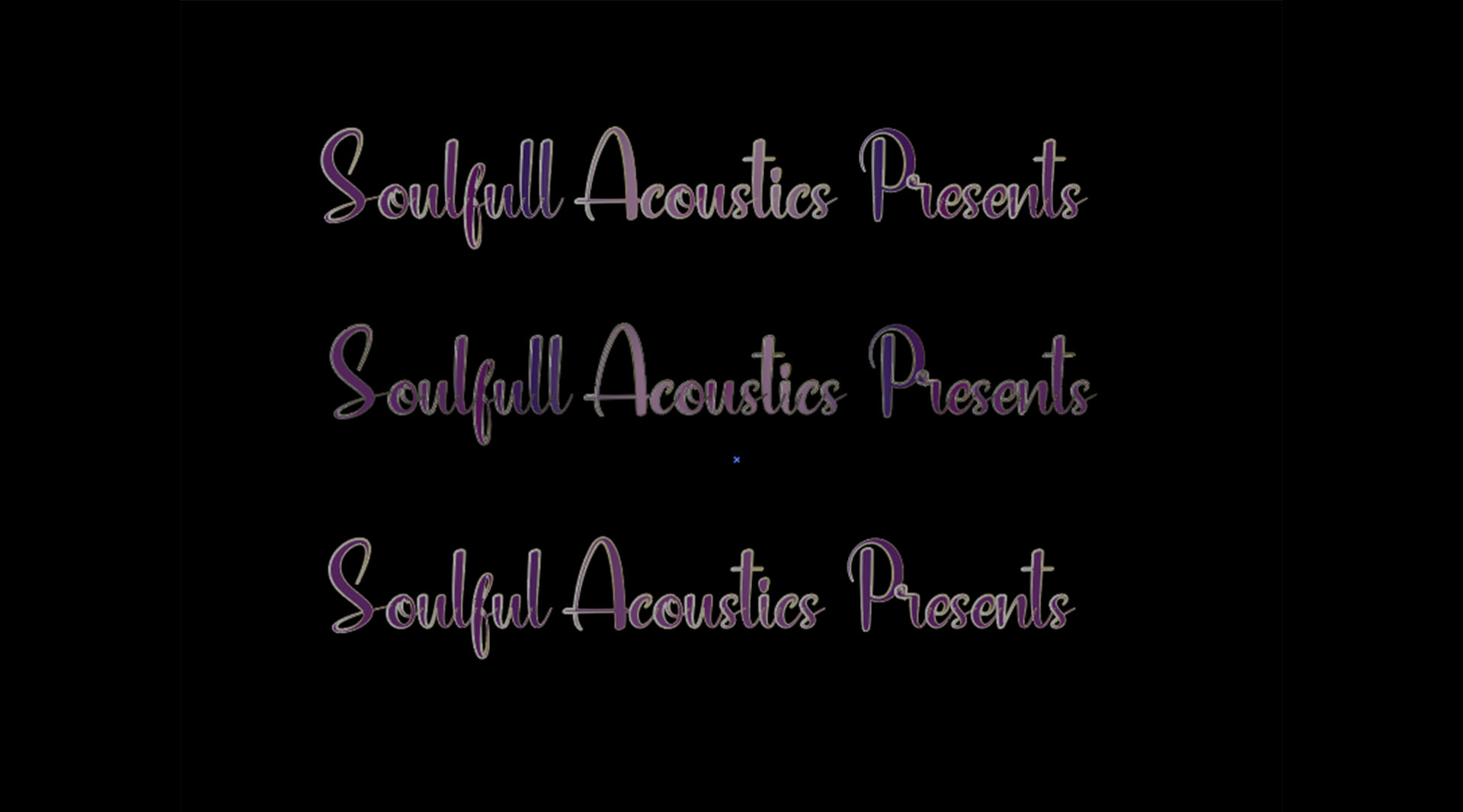
Fourth Idea
-
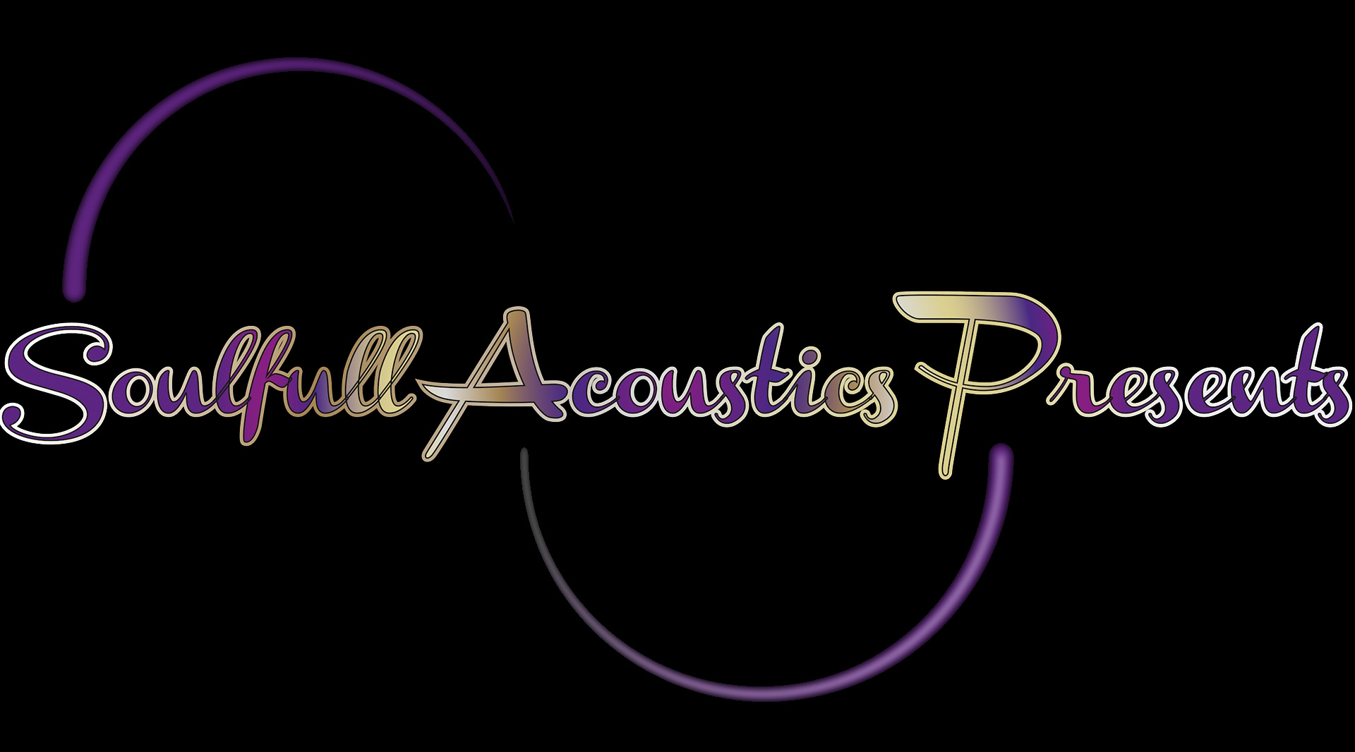
Third Idea progress -
Fourth Idea -

Fourth Idea progress -

Fourth Idea progress
02
The Solution
Objective
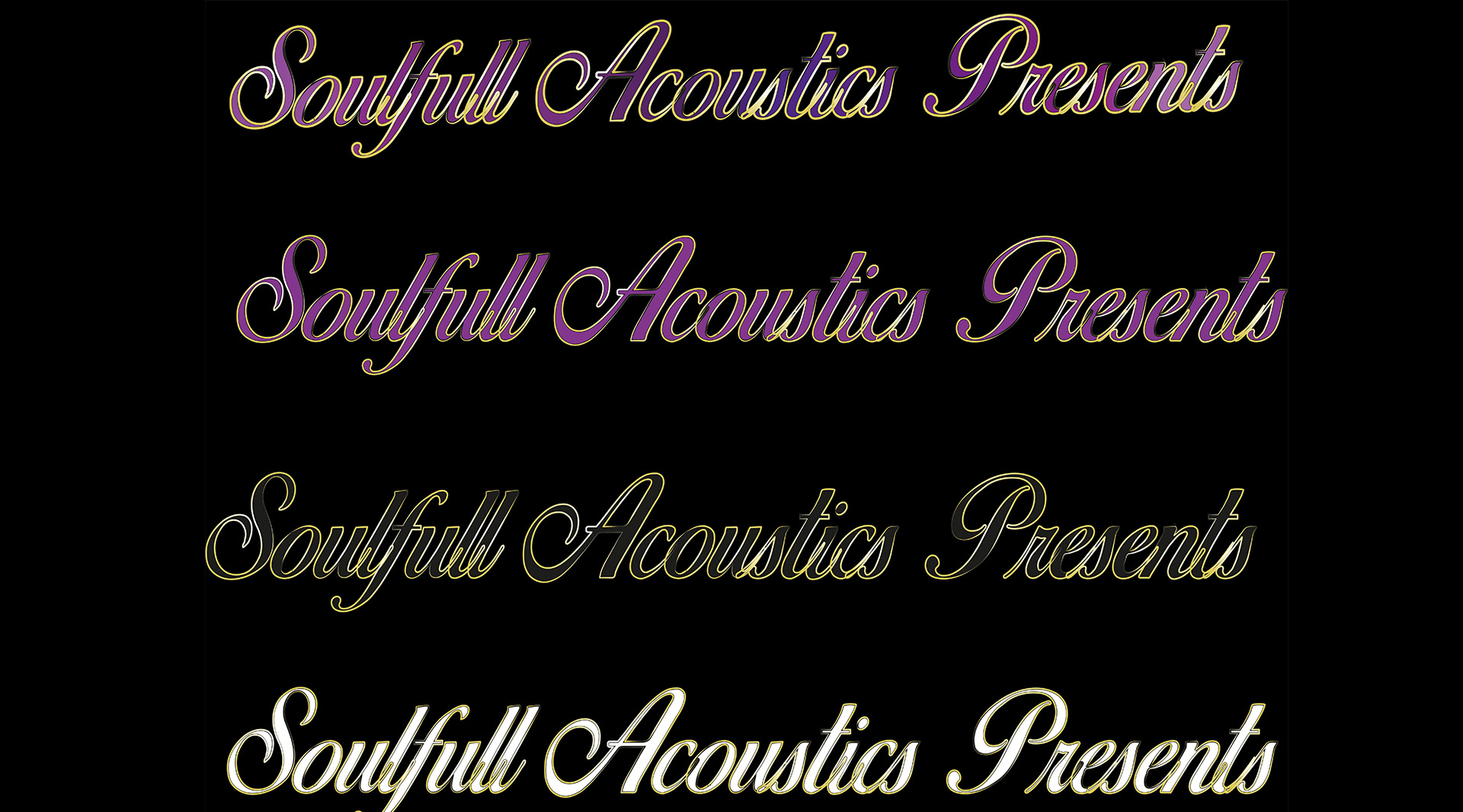
The cllient decided she wanted the design in 3 different colourways. Gold Purple and white were chosen. She wants to use the gold version as her main logo, coupled with 2 which she can include for special events.