01
Project Challenge
Objective
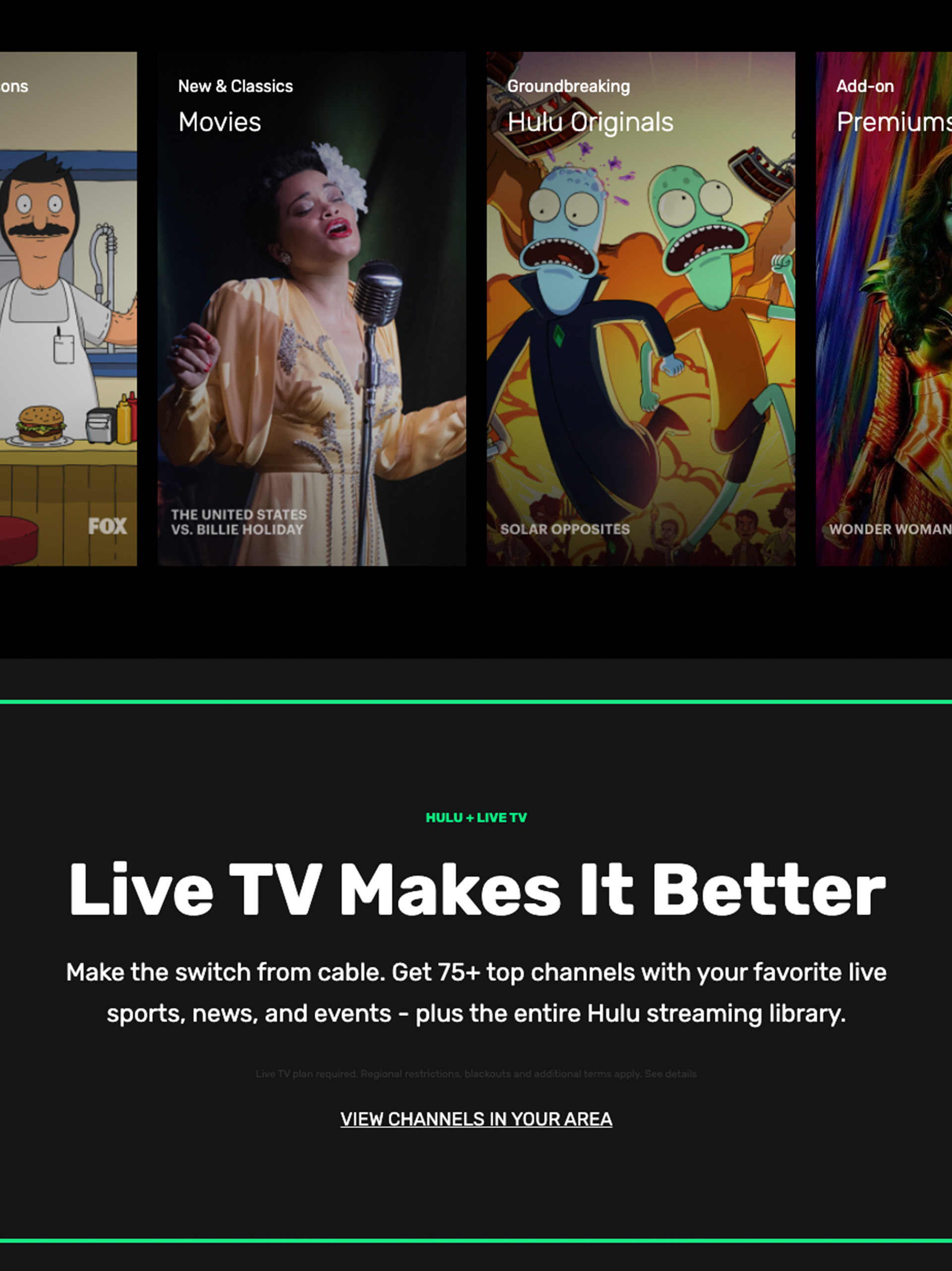
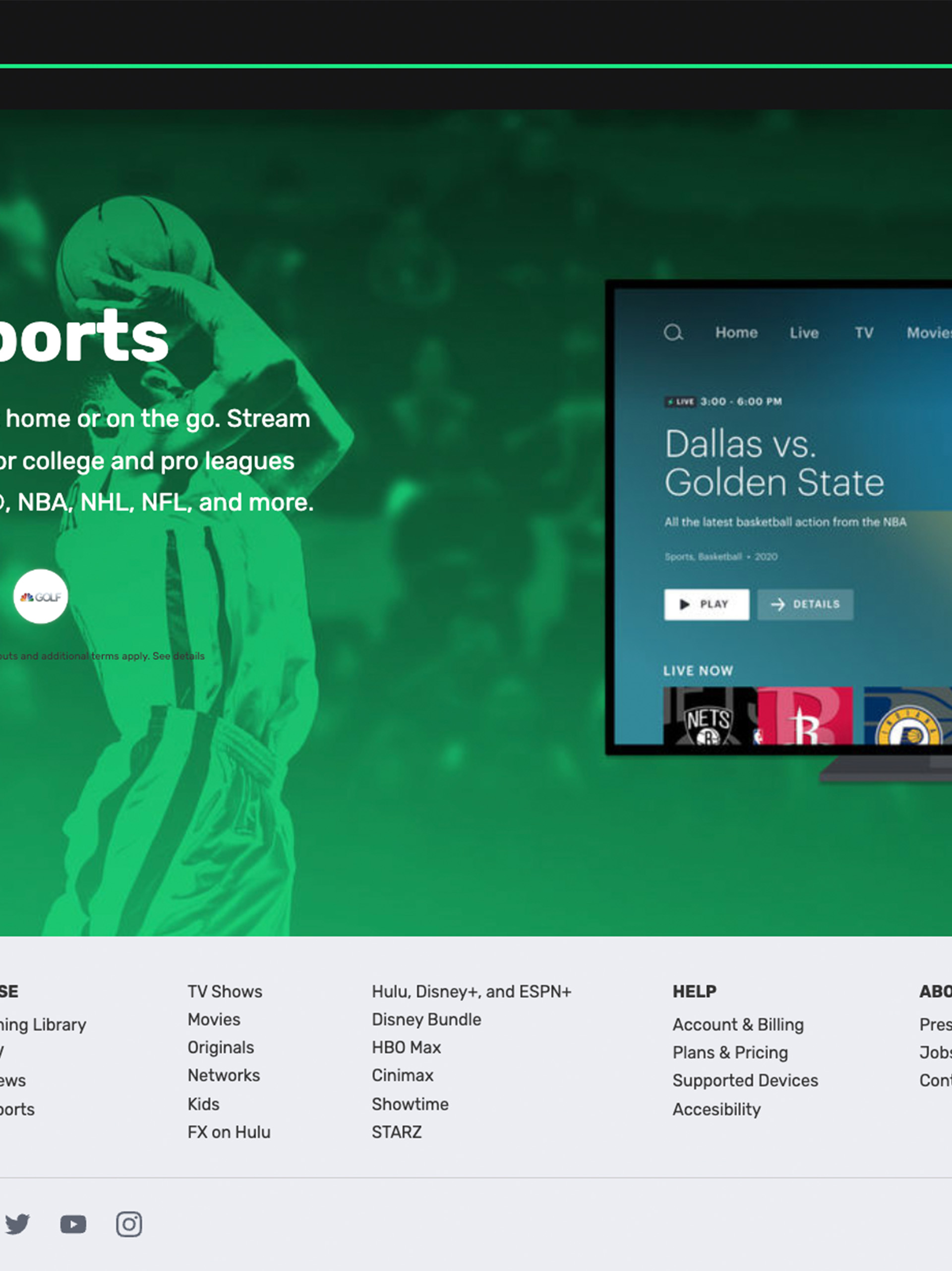
The main motivation behind the homepage was to recreate the webpage of a large multinational corporation using some of the skills I learned. I wanted to see how some of the CSS skills I learned create some of the most popular web sites we use on a daily basis. The plan is to duplicate the homepage and then produce my version. This is what I'm currently working on at the moment.
02
Design Approach
Objective
I was happy to maintain a similar layout. But I want to make it more interactive. The original design is a little static. I'll incorporate the same text from the original site. I will retain the same images from the original tutorial as well.
03
The Solution
Objective
Overall, I am satisfied with my version. I included the Hulu logo in the loading page to build up the suspense while the site loads. The main image was utilized to create a fantasy atmosphere, enticing the user to explore. I used a combination of green and white fonts, like the original Hulu page, because I believe the green would have been too much throughout. I added some interaction when the user hovers over the images. I incorporated the same footer as it resembles the original Hulu webpage, and I also included a FAQ section.
