01
Project Challenges
Objective
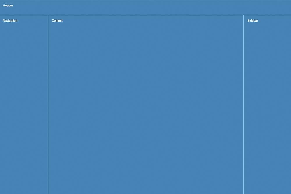
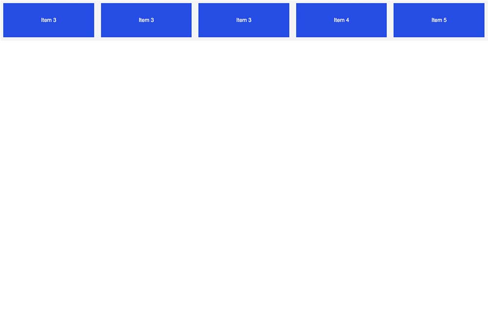
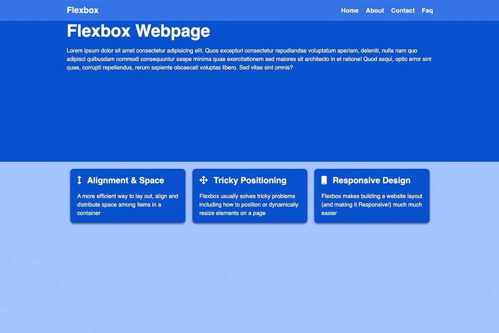
To improve my understanding of layouts, I decided to explore CSS grid to improve the look of the page. I used my understanding in grid containers to complete small CSS projects, by using additional properties and features for controlling the layout, I have used my understanding in grid containers to complement small CSS projects, using additional properties and features to control layout. Grid-gap is used to create gaps between grid cells, grid-template-areas are used to create named grid areas and justify-items are used to align items within grid cells.
02
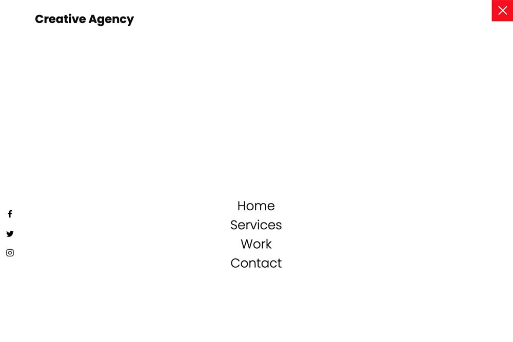
My Approach
Objective
In order to use CSS Grid, I had to define a container element as a grid container. I did so by applying the display: grid; property to the container item. Once the container is a grid, it meant I could start defining the grid structure by using the grid-template-columns and grid-template-rows properties.

03
Continued
Objective
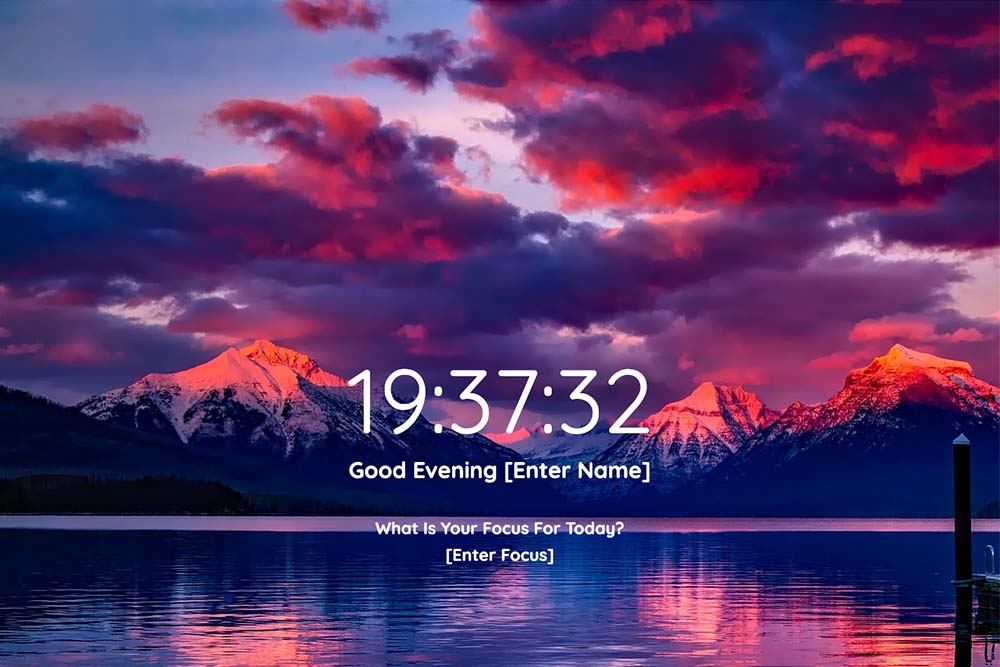
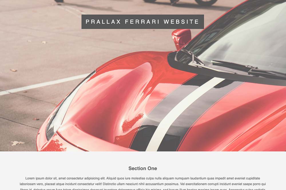
To test various styles based on device or screen size characteristics, overlays and media queries were employed. It allows me to set specific CSS rules that will only be enforced when certain conditions are met. I also tried parallax scrolling by manipulating the positioning and background properties of the elements.


04
The Solution
Objective
There are many variations of passages of Lorem Ipsum available, but the majority have suffered alteration in some form, by injected humour, or randomised words which don't look even slightly believable. If you are going to use a passage of Lorem Ipsum.